OptAdEasy is an AI-driven Google Ads optimization platform that attracted around 3,000 small-to-medium businesses and agency users within six months of launch. Despite featuring 11 powerful advertising optimization functions, including automated bidding, keyword optimization, and AI ad copy generation, the complex interface design and unintuitive user flows severely prevented users from fully utilizing these capabilities.
Web App
User research, information architecture, interaction design, visual design
8 months
Asiapac
Lead Designer
2024
Collaborated with development team and product manager
www.optadeasy.com
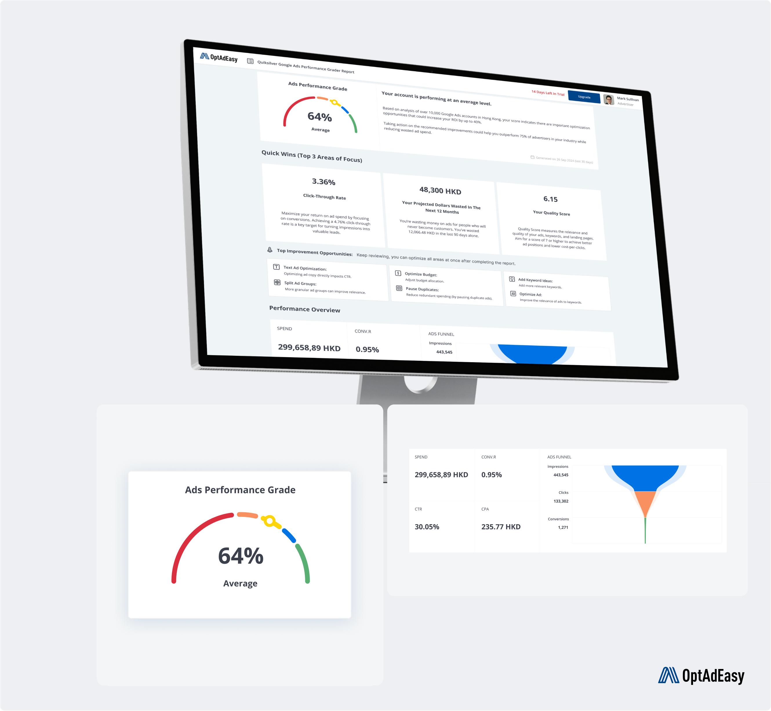
Powerful optimization tools were buried in complex navigation and information-overloaded interfaces
Users couldn't understand the reasoning behind AI optimization suggestions, leading to low trust in the system
Despite data richness, the presentation was complex, making it hard for users to extract valuable insights
Completing key tasks required too many steps, reducing work efficiency
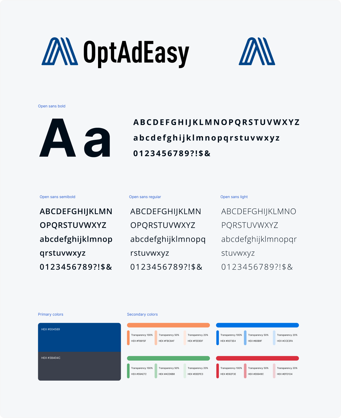
Transformed to a professional blue color scheme while maintaining the original logo per client request, with unified typography and component systems.
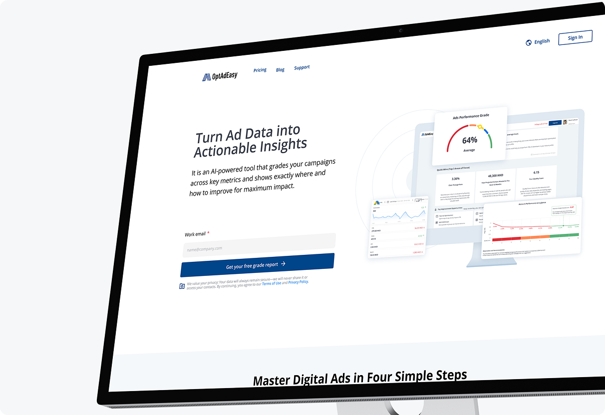
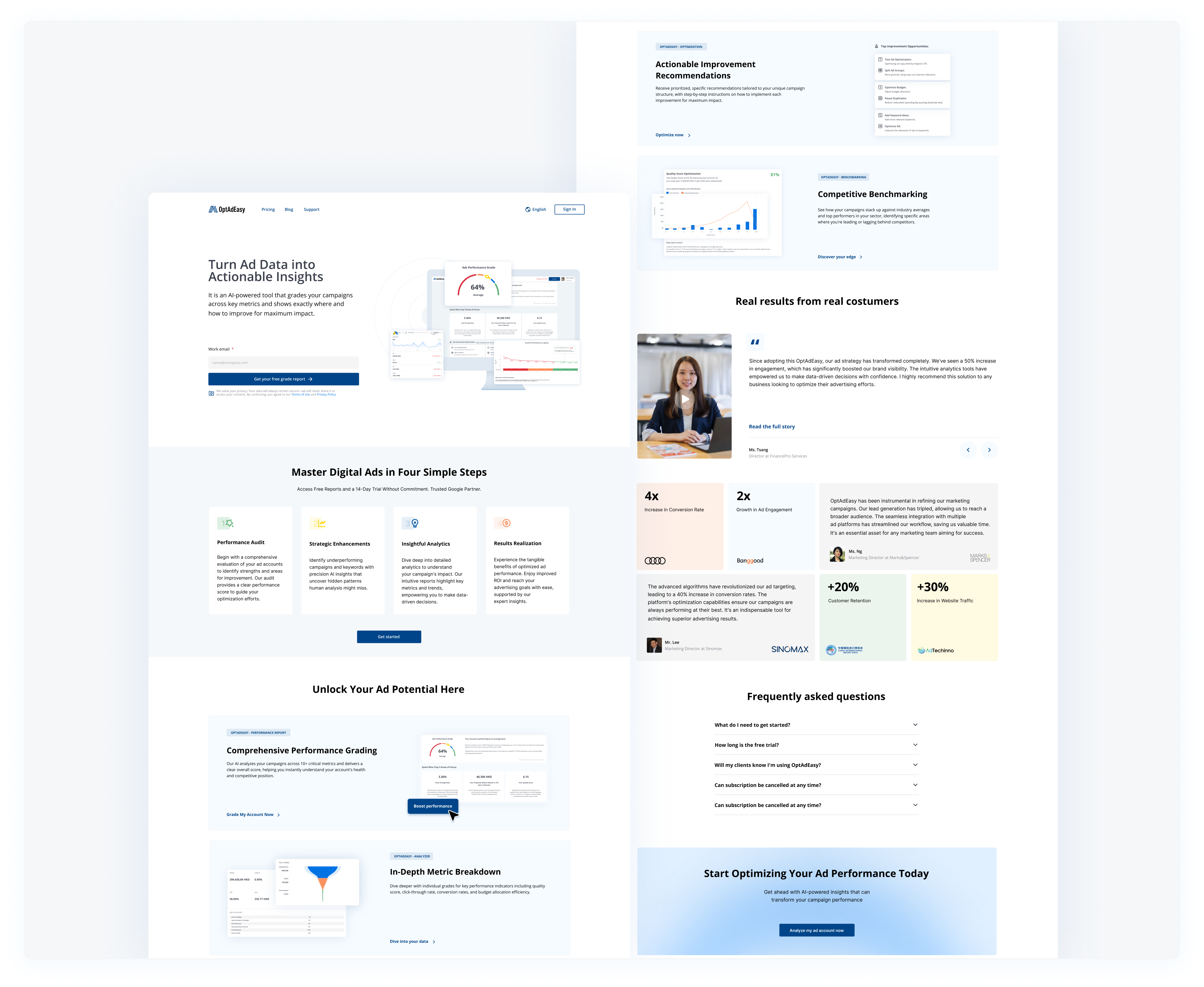
Reimagined landing page with clear platform benefits, compelling testimonials, and prominent FAQs that directly addressed conversion barriers.
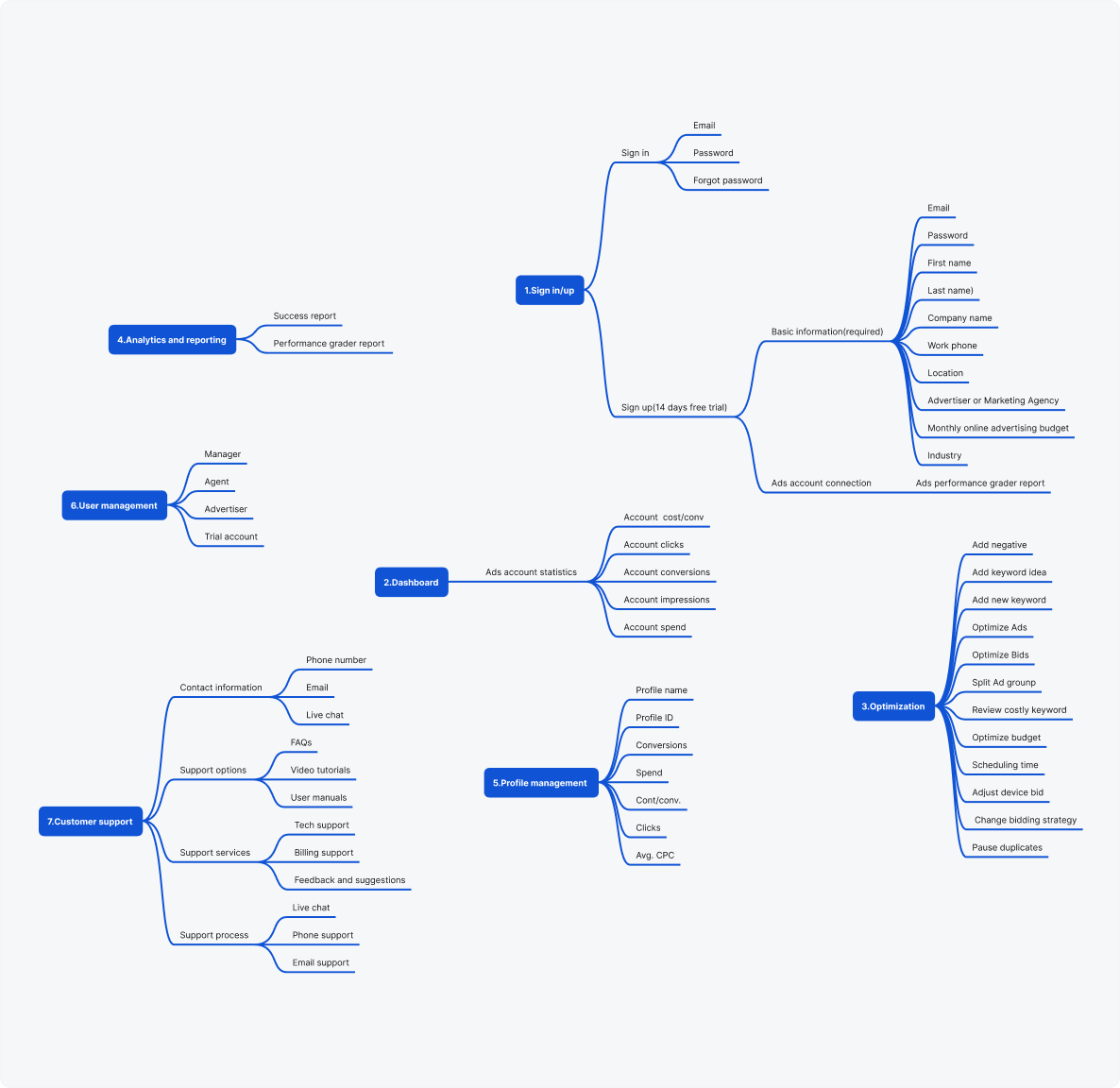
Implemented task-based organization that matched users' mental models, increasing feature discovery by 40%.
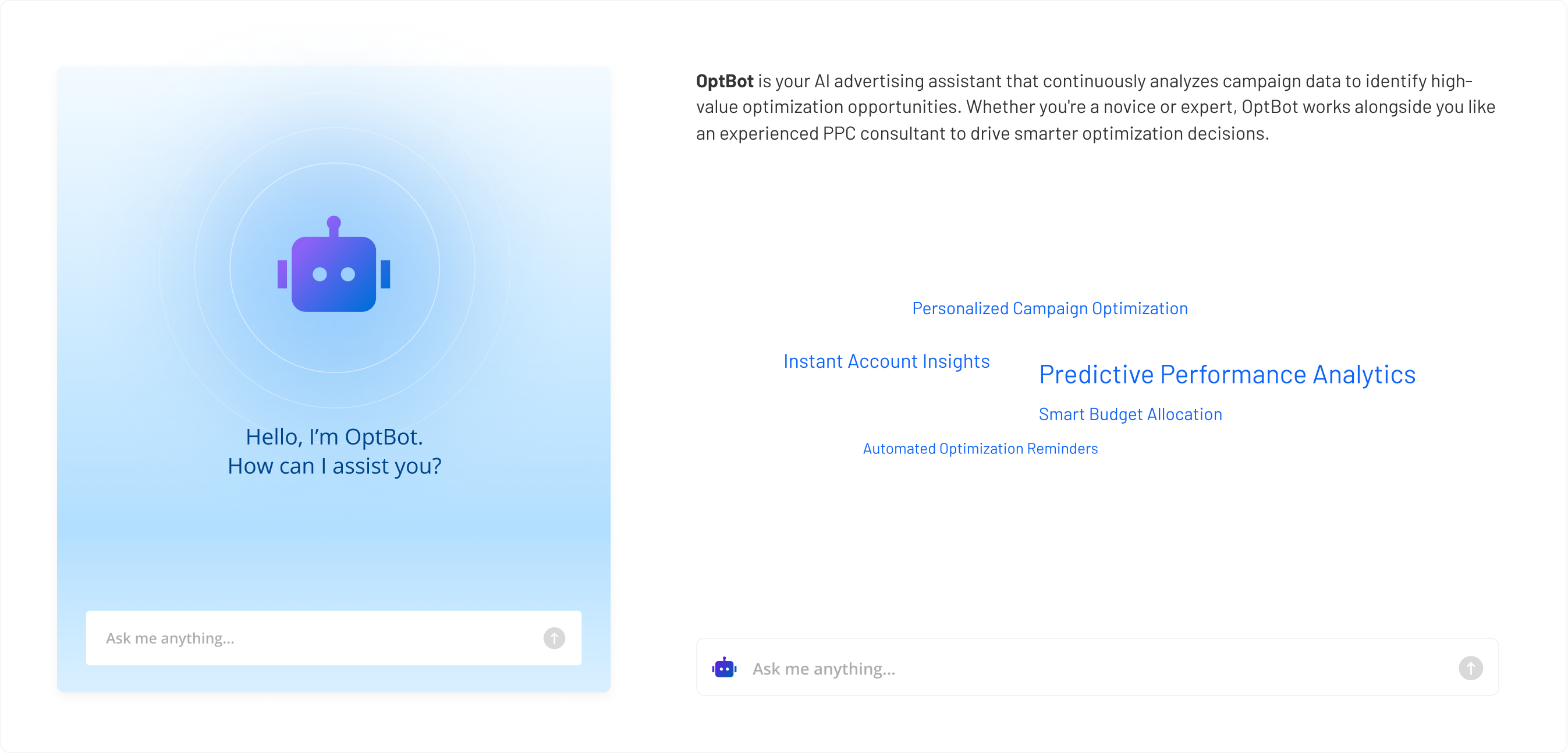
Created wireframes for an AI assistant that builds user trust through transparent explanations of automated recommendations, giving the AI functionality a friendly, approachable identity.

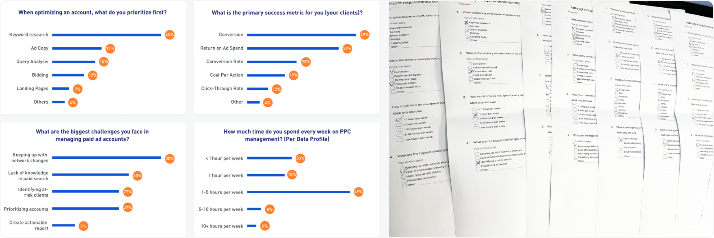

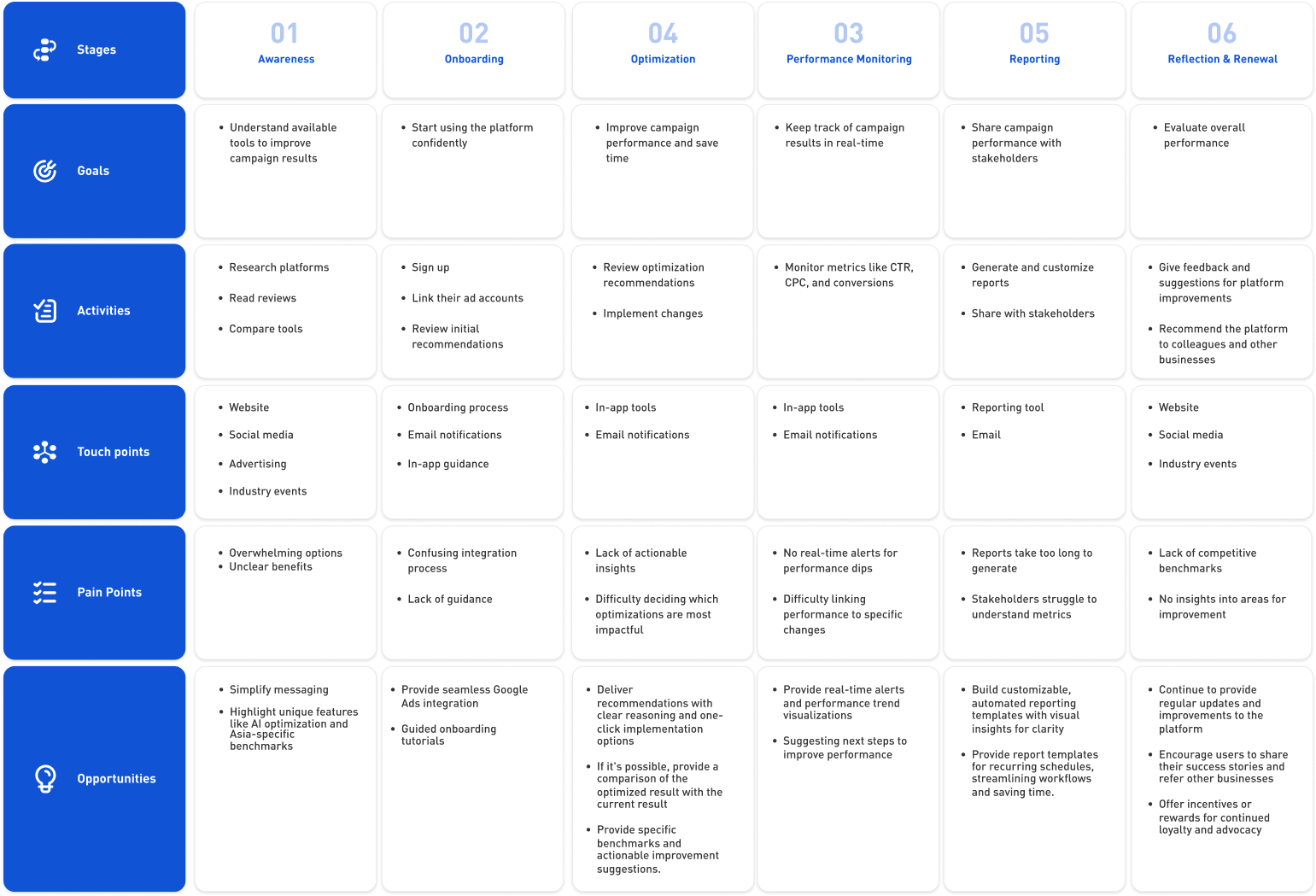
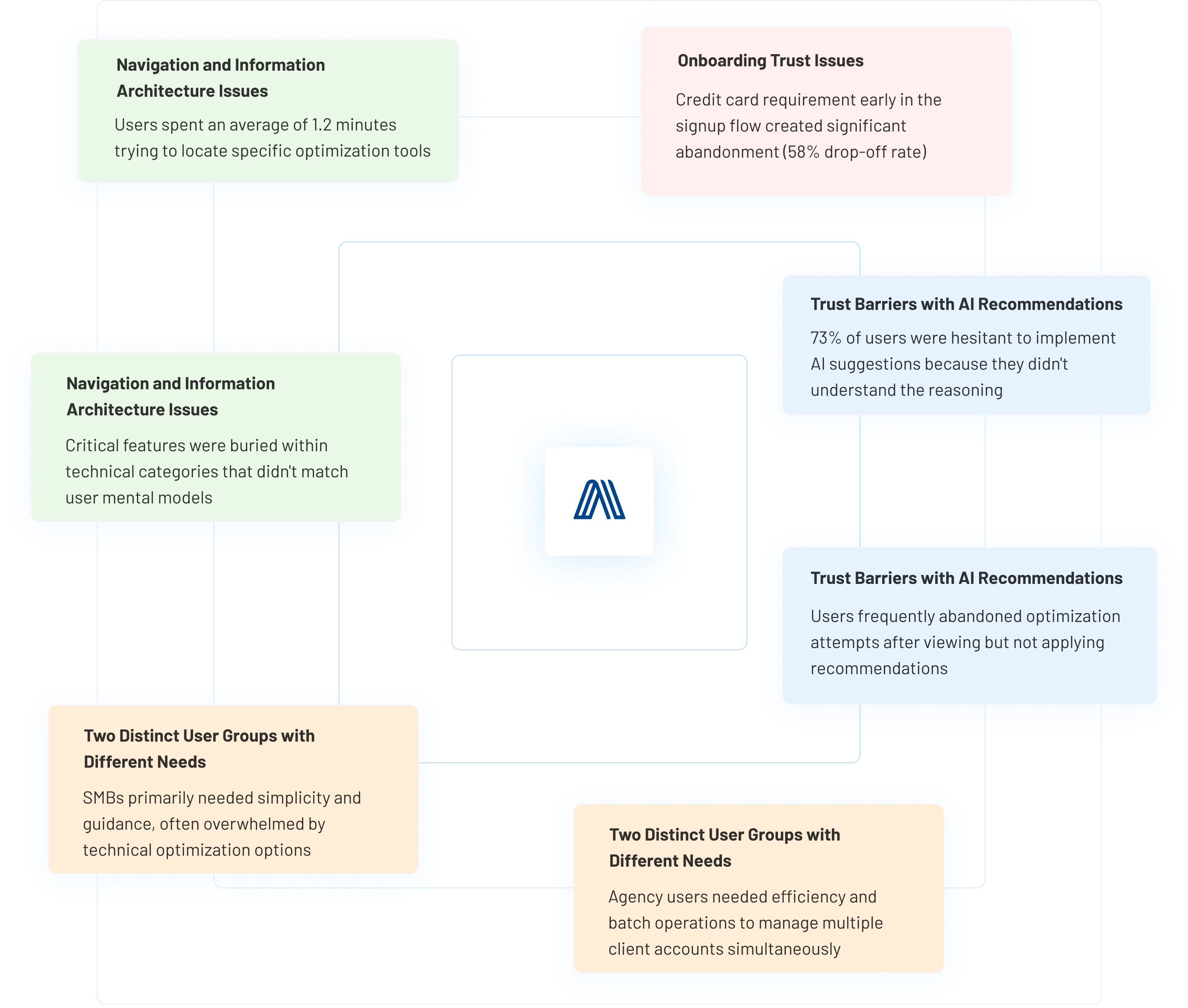
Reorganize navigation hierarchy
Reorganize features based on user tasks
Move credit card requirements to later in the user journey (after trial period)
Add explicit security explanations and compliance badges
Design an AI explanation system (OptBot) that presents reasoning behind recommendations
Implement "Review mode" to show potential outcomes before changes are applied
Offer simplified interface options for SMBs and advanced tools for agencies
Create role-specific templates and presets for common optimization tasks
The existing landing page suffered from unclear value proposition and low conversion rates. I redesigned the page to directly address key barriers to adoption while establishing a more professional brand impression.
The original sign-up and sign-in flows created unnecessary friction and high abandonment rates. I simplified these critical entry points while adding strategic trust elements to address user concerns about commitment.
The Performance Grader Report is a critical first-value moment for new users after connecting their Google Ads account. I redesigned this experience to translate complex advertising data into clear, actionable insights that build immediate trust in the platform.
The optimization module is where users take concrete actions based on their account analysis. I restructured this critical section to transform complex Google Ads optimization processes into clear, accessible paths that users could confidently implement.
The redesigned dashboard provides a streamlined overview of advertising performance. Users can easily track conversions, spending, and compare current and past performance. With enhanced visuals and intuitive navigation, the dashboard highlights top-performing campaigns, empowering advertisers to quickly identify successful strategies and optimize their efforts more efficiently.
The redesigned report feature offers comprehensive insights into advertising performance with enhanced usability. Users can generate on-demand or scheduled reports, providing detailed analysis and performance grading. This redesign simplifies tracking success metrics and optimizing strategies, enabling advertisers to make informed decisions with clear, actionable data.
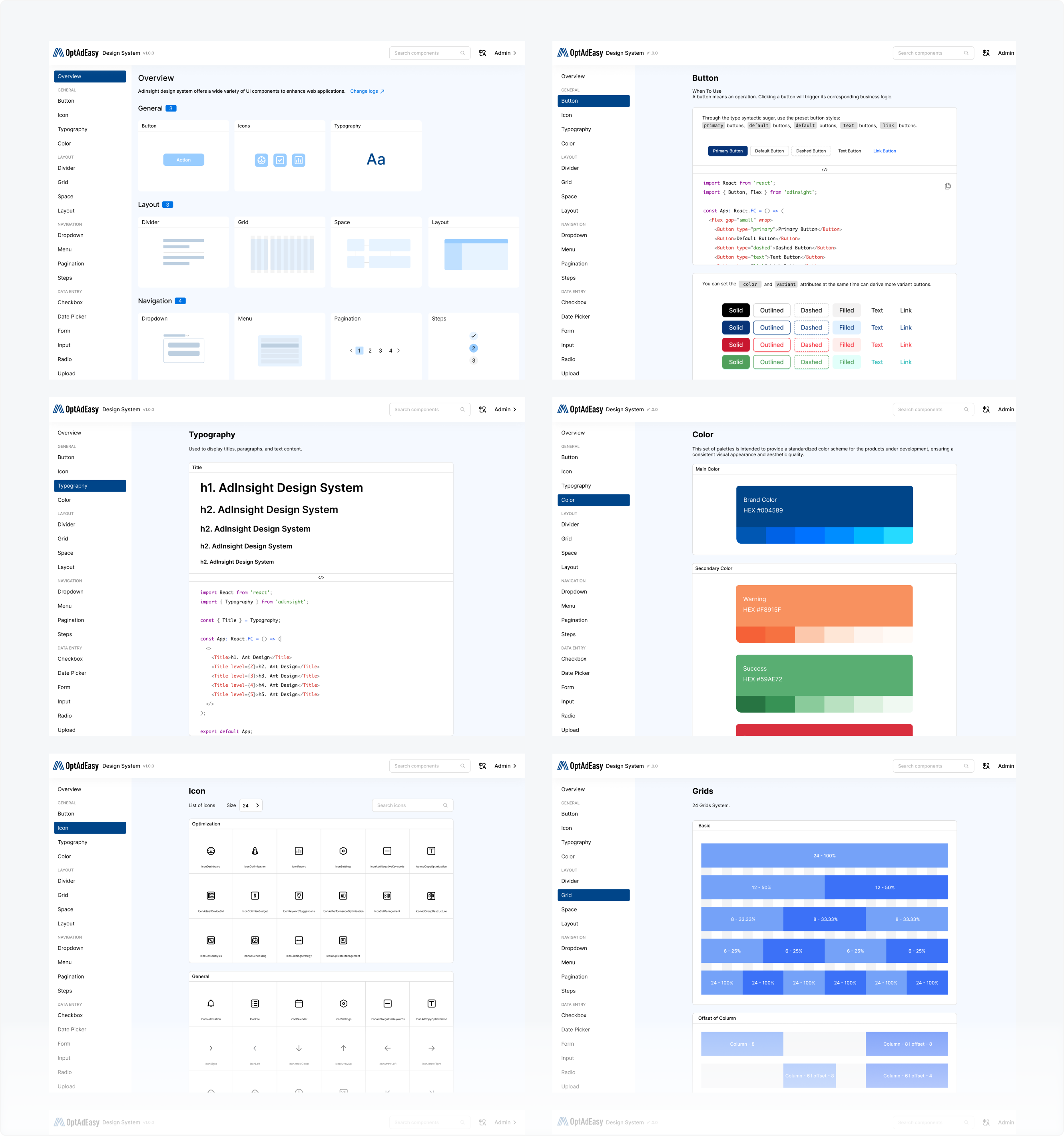
We developed OptAdEasy's initial design system to ensure consistency and scalability. Using our existing framework, I tailored a system that reflects its unique style. This involved defining reusable components, refining design tokens (colors, typography, spacing), and introducing new core components to enhance usability and cohesion.
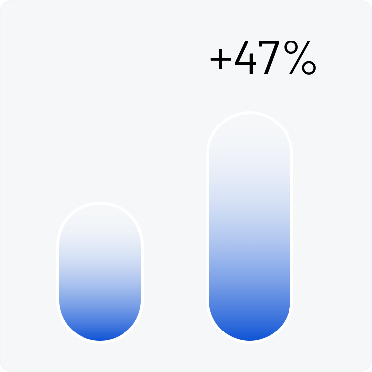
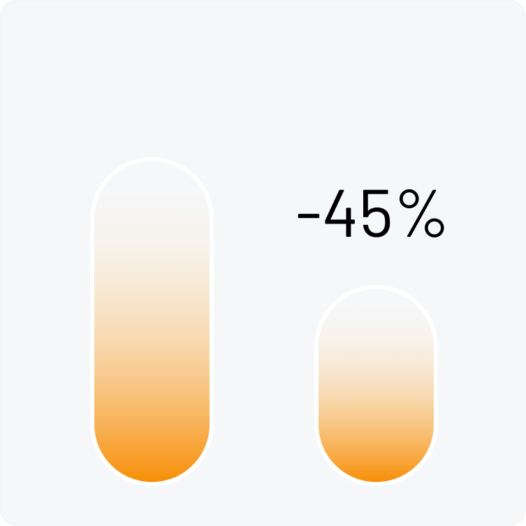
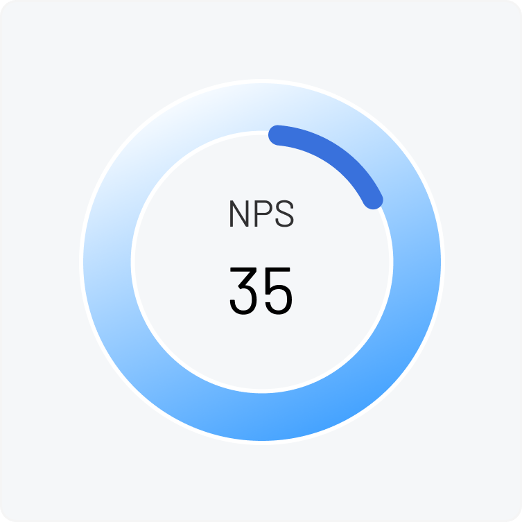
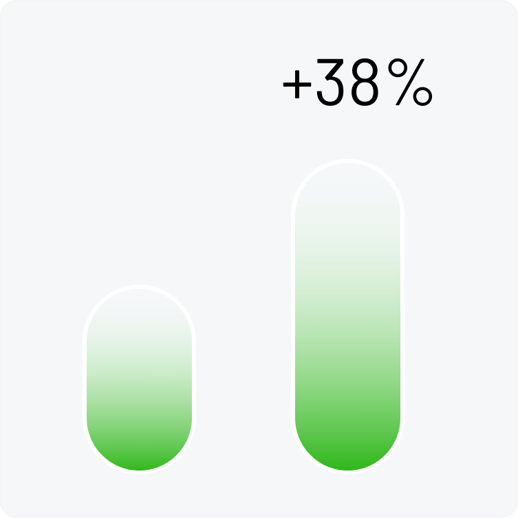
Testing OptAdEasy with 126 advertising accounts showed that our user-focused design improved business results significantly - ROI grew by 20%, conversion rates rose by 15%, and daily work time dropped from 2.3 hours to under 1 hour. User feedback guided our improvements throughout the process. Next, we'll personalize the experience further, add better analysis tools, expand to more advertising platforms, and enhance our AI recommendations with more comprehensive data.